Unified design system for the Al Rajhi Group
AZM X helped build a unified design system for the Al Rajhi Group and its companies: one source for every product, and each brand keeps its identity.
The problem
The Al Rajhi Group and its companies own 17 digital products, from mobile apps and websites to ATMs and point-of-sale terminals. Design work was spread across those companies and products, and the same design decisions were being made again from team to team. The Group needed a unified digital language to hold it together while leaving each brand its own style.
The challenge
A unified language had to bring 6 brands together without flattening any of them, and let teams ship faster while every release stays governed. So every design decision began with 5 questions.

01
Consistency
How does one design language serve 6 distinct brands without flattening their identities?
02
Scale
How do we serve 17 digital products, from mobile to ATM, from a single source of truth?
03
Speed and control
How do teams ship faster while every release stays governed and on-brand?
04
Inclusion
How do we make every experience equally natural in Arabic and English, and accessible to all?
05
Continuity
How does the system keep evolving after handover, owned and driven by the Group itself?
The objectives
5 objectives for a unified experience across the Group
The approach
A system built in layers
5 layers, each resting on the one before, from listening to the Group's teams to handing over the system and transferring its management to the Group.
Discovery
Workshops, interviews and surveys across the Group, supported by benchmarking of leading design systems.
Foundations and tokens
A complete token architecture (colour, type, spacing and modes) built for multi-brand, multi-theme use.
Components and patterns
A reusable library designed for scale, responsive, accessible and consistent from design to code.
Documentation and enablement
A live documentation site, a public landing page and a training library for every team.
Governance and handover
Governance and adoption models, a core-team proposition and structured knowledge transfer.
The solution
A unified language with 6 brand identities
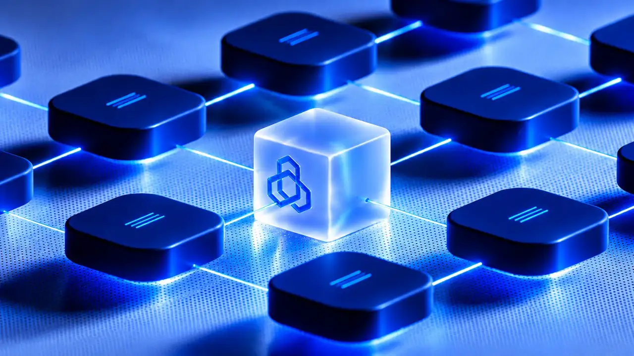
The system rests on shared foundations: design tokens for colour, type, spacing and modes, with each company's brand theme on top. A component is designed once, then appears in every brand in that brand's own colours and character.
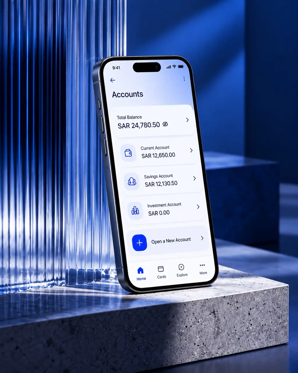
The library holds 2,000 UI components and 30 standard user journeys, and works in Arabic and English as equals, in both reading directions, to WCAG AA. The live documentation site explains how to use them.
Delivery and impact
Three stages of the work, stacking as you scroll, just as the project's layers do.
05
What the Group now owns
The Group now owns 6 deliverables:
Foundations and tokens: the complete design foundations and token library for multi-brand, multi-theme use.
Component library: 2,000 UI components built for consistency and scale across every brand.
Standardised journeys: 30 reusable user journeys mapped into shared experience patterns.
Documentation: a live documentation site, a public landing page and learning resources.
Governance and core team: governance and adoption models, with a proposition for the team that sustains the system.
Enablement and transition: training, knowledge transfer, account and domain transfer, and a dedicated support period.

06
The system's added value
The system changes how teams create and sustain digital experiences. It brings consistency to today's work and lays a stronger foundation for what comes next:
A unified experience across the Group: a consistent experience across brands, products and customer touchpoints, grounded in one shared design language.
Faster delivery: teams build from proven patterns instead of starting again, reducing repeated effort and shortening the path to release.
Scale with brand flexibility: shared standards bring the Group together while giving each subsidiary room to keep its own identity.
Quality by default: accessibility, responsive behaviour and consistency become part of everyday design and delivery decisions.
Continuity beyond handover: clear ownership and contribution paths give the Group a practical way to maintain and grow the system.
07
The results in numbers
Today a unified, governed design language serves 6 brands and 17 digital products, from mobile to ATM. It rests on a library of 2,000 UI components and 30 reusable user journeys, documented, governed and handed over to the Group in full.
UI components across all brands

The ARG Global Design System marks a structural shift in how the Group builds digital products. Design decisions that once repeated across teams now live in one governed place, balancing speed, control, and quality, and giving every subsidiary a foundation it can trust.